THE OFFICE
Your Favorite Show (Maybe) Rebranding
Your Favorite Show (Maybe) Rebranding
DUNDER MIFFLIN
I am taking on this challenge as a way to showcase my branding and visual design skills. I was thinking of ways to get visitors to better see my capabilities and I thought that it would be easier if we all started at the same place: the beginning. I chose to design a familiar product so that the process can be more relatable to the viewer. I chose to rebrand the fictitious company, “Dunder Mifflin” from the American TV show The Office.
DESIGN BRIEF
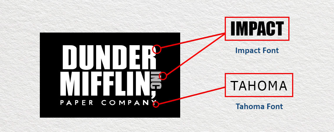
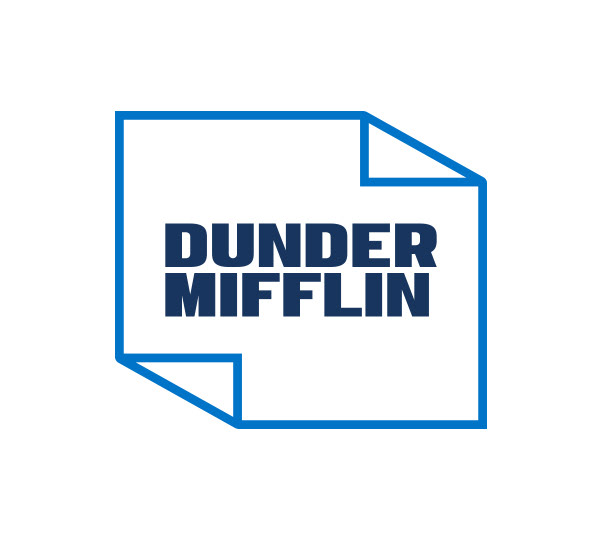
ORIGINAL LOGO
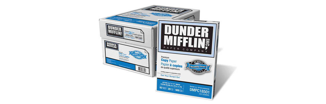
REAL PRODUCTS
In November 2011, Staples Inc. announced that they are selling their own product of manufactured paper under the "Dunder Mifflin" name, under license from NBC's parent company, Comcast. The Dunder Mifflin products are produced and sold by Quill.com, a wholly owned subsidiary of Staples. As of July 2018, Quill.com no longer carries the products, listing them as having gone on “permanent vacation.“
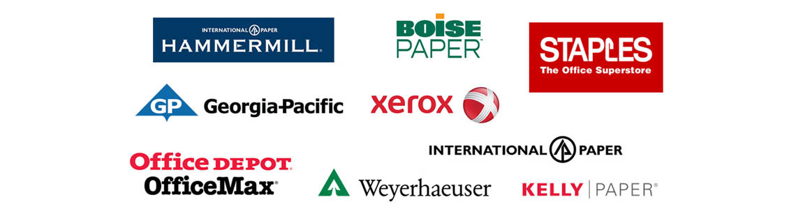
COMPETITION
Logos from the competition below:
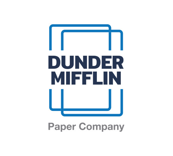
CONCEPTS
Here are some of the first logo "concepts" that I came up with. The logo design process is fun but it can also be challenging. Put yourself in the mind frame of the team tasked with deciding the direction of the new brand for the Dunder Mifflin Paper Company. Which design do you like the best?
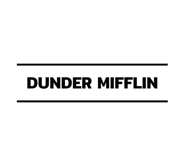
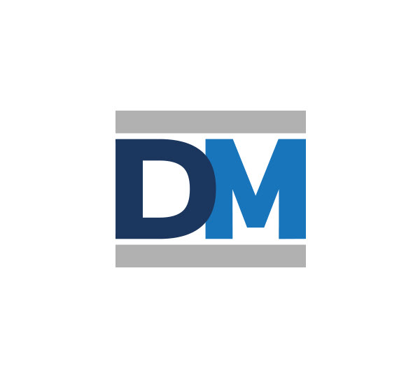
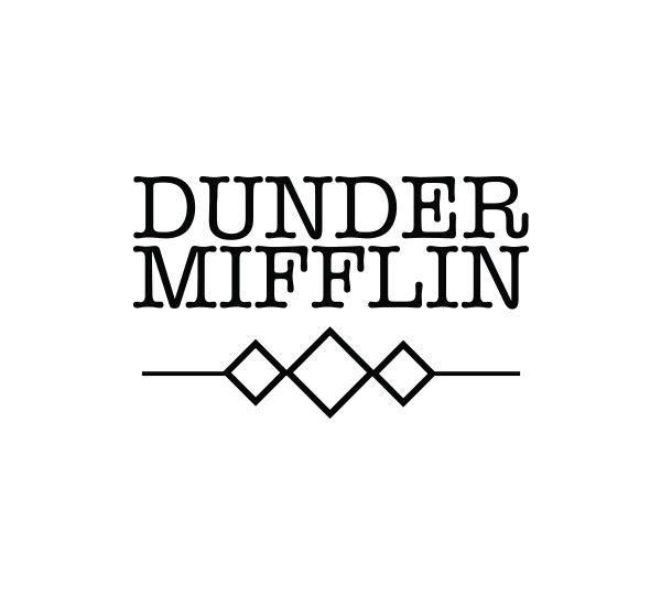

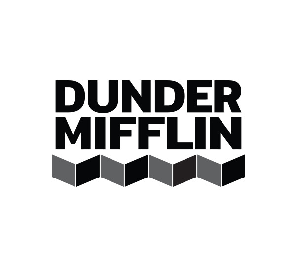
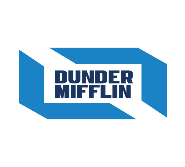
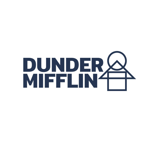
FAVORITE CONCEPTS
You can't pick them all. In this case, I selected four designs. Take a look at the Design Brief again if you like. We will select one concept to move forward with and make any necessary tweaks to the design or colors.


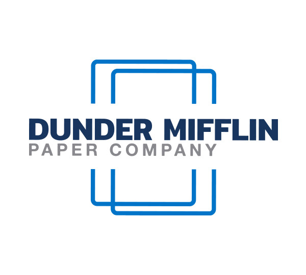
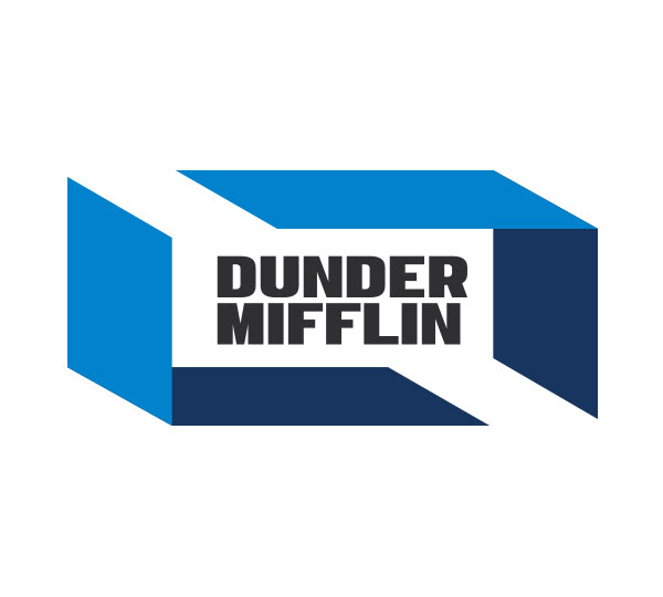
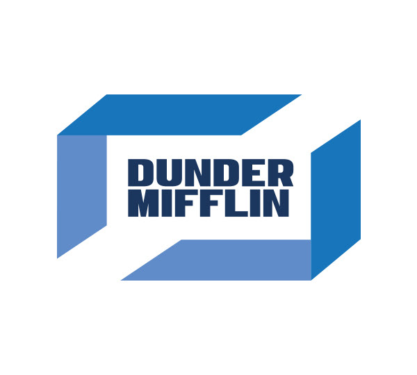
FINAL DESIGN
I selected the design below. This logo really makes me think about paper and has a clean design. It's one of the concepts that already feels the most complete (doesn't always mean it's the best) and doesn't need to be worked out further. The 3 colors work well and overlapping paper sheets in the design add some flair.